Today I visited the Manchester Gallery to see if I could find some examples of artists drawing styles. There is currently an exhibit on called The Sensory War 1914-2014 which examines artists work from 1914 to the current year and demonstrates war in all it’s facets from engineering to medical advancements. Not only were there plenty of extraordinary pieces on display for me to explore techniques styles but there was also with there being so many decades worth of war imagery that were both exciting and horrifying that the contemplating the importance of the subject matter and it’s effect on the piece became an invaluable part of my visit to the gallery. On a side note, it was completely unitnentional that I should visit the gallery on Remembrance Day yet seemingly apt that everyone else there and myself should experience this gallery during the two minute silence.
As the gallery did not allow the taking of pictures which is understandable, I made a point of marking down which artists stood out for me and that I could use as a point of reference for technique for my own work.
Wyndham Lewis
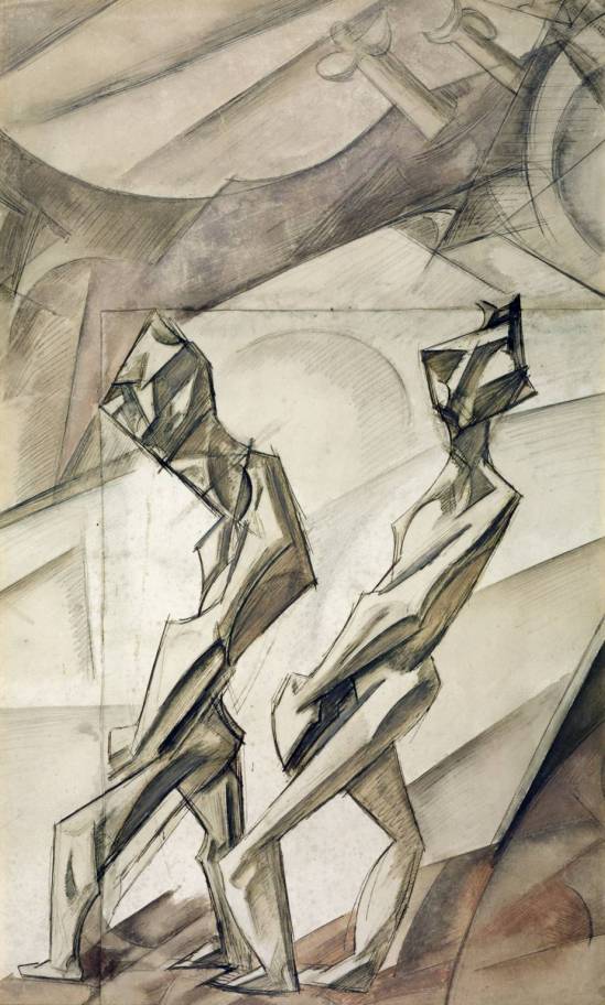
The first artist’s work on display that caught my eye was Wyndham Lewis. His painting “Two Mechanics” from 1912 demonstrated immediately some of the uses of mark making and line work that I have been learning at the beginning of the course. The figures have been drawn with abstract intention and yet the definition made by hard blocks of shading and thick outlines add a lot of obscurity them. I can see a mix of hatch shading with the watercolour that Lewis used in the background specifically. Lewis has done this with a lot of simplicity in mind, something I should take on board where there does not need to be a lot of it to create a lasting effect.
Heinrich Hoerle
Hoerle is a German painter who took inspiration not least of all from the aftermath of war. His work, Die Krüppel or The Cripple Portfolio contains some very striking imagery of those who have been most afflicted by the weapons of war, showing the loss of limbs and tragedy of those whose must live without them. He has a very distinctive style which is why I have included him in this post.
The Three Invalids 1930
The Three Invalids is definitely a subversive image. I looked at the painting for a good minute or two before reading the description to see if I could make sense of what it represented. At first I thought it was a celebration of man and maths with how some of lines are in perfect sync both on the buildings and the figures. Then I considered how it represented augmentation and robotics. At this point I was curious what year it was painted in and in reading the description, learned that there were elements of everything I had thought it to be and finally the name of the painting also made sense. In terms of technicality of the painting, I really admire the geometry of the shapes used for both the men and the buildings mixed with the more accurate representation of their heads. This to me demonstrates how since the war, these men have become more mechanical and also how much of their humanity has been forcibly taken from them.
The Cripple Portfolio or Die Krüppel 1920
Similar to The Three Invalids, Die Krüppel focuses on the aftermath of war and the results it bares. In this particular set of images there seemed to be a stark contrast from sadness to madness as is demonstrated by the two images above. The first one shows the man who has lost his arms and feet looking intensely at an arrangement of pots containing hands, indicating madness and insanity from the loss of not only his limbs but seemingly his mind as well. The second picture is something a lot more typical and perhaps something that each of us have witnessed at some point even in today’s world where a man begs for change while wearing the uniform he used for the war.
Both images are done using lithography and in it’s simplicity gives the onlooker a chance to focus on the subject. There is little detail and hardly any shadow or lighting and the figures are more like caricatures than depictions of real people. It could be the juxtaposition of the two that gives these images such an impact.
CRW Nevinson
One particular artist’s work that caught my eye almost immediately was that of CRW Nevinson (or Christopher Richard Wynne Nevinson). He was one of the foremost wartime artists and was also a wartime correspondant. His paintings would most commonly reflect what he had seen during the war and in doing so has created incredibly vivd imagery of those events which grab you as soon as your eye catches it. I managed to find a couple of examples of the work that I saw in the gallery. This was also my first time seeing lithography which I had not heard of until I researched this particular painter.
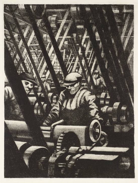
The first one I would like to talk about is called “Making the Engine” 1917.
I enjoyed how this picture focuses on one worker who seems to be engulfed by machinery and that he along with hundereds of other men in the factory, are all additional parts that make the machines work, like gears and cogs. This is emphasised by the lack of detail on the faces making them less personable and also by using a lithograph, producing one monochromed image where every aspect of the picture is equal. I really do like the contrast of the belts that stream back and forth and go right to the back of the room, suggesting an neverending production line.
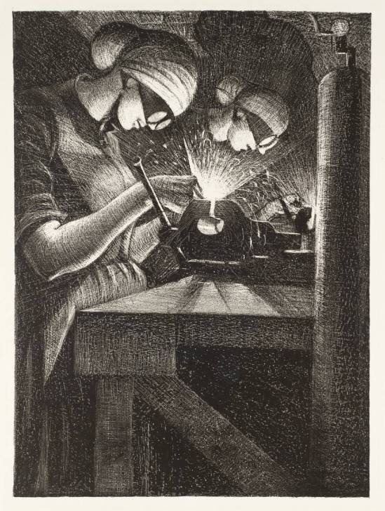
Another one of Nevinson’s paintings that I saw was called “Acetylene Welding”. The image shows two women working on welding metal.
The combination of his fine line work and the lithograph print has created an explosion of light from the centre of the image. It really does feel alive with activity as the sparks fly out from the machine. I really admire the detailed line work of the objects and the people and then the fine layers on top which distinguish the sparks and light.
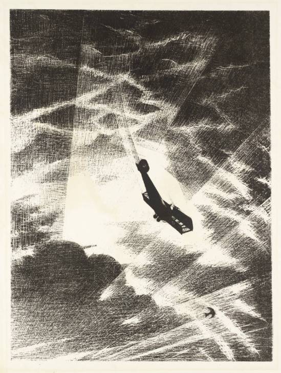
The last painting by Nevinson that I found particularly appealing is called “Sweeping Down on a Taube”
This was perhaps my favourite image not only of Nevinson’s but also the day. By knowing where and where not to put marks, Nevinson has created incredibly vibrant and vivid imagery which clearly depicts the energy and sudden nature of war. As the explosion bursts light beams through the clouds from below we can see it shattering the sky where the plane and a lone bird silhouette so effectively against it. Like the last picture of the welders at work, the lithography on the painting and perhaps even some slight decay over time, has left some hairlines scratches along the image which can easily be utilised as sparks once again.
I have learned a lot from my visit to the gallery and specifically this exhibit. A lot of very invoking imagery towards the war and yet much of it has been done using simple methods for striking results. I often consider how much detail I need to go into when doing my own drawing and that perhaps if I am trying to convey a message of some sort then I don’t need to think too deep to portray that message.


