Pt 2 – Project 2 Exercise 1 – Experimenting

A collection of sketches using different mediums to look at textures.

IMG_20150113_135838~2


Here I have experimented with different ways to demonstrate textures. With the images on the left I used a Chinese ink stick and applied it to a leaf for the one on the top left. I first tried to put the ink on the paper and then pressed the leaf on it in the hope that it would leave an impression or perhaps life some of the ink off to leave a pattern. Unfortunately this did not work so I then decided to do the more logical thing and apply the ink directly onto leaf and then pressed that onto the paper. It is interesting how there are blotches of ink that have congealed into specific places which could have been applied by brush if that was the goal however the detail of the leaf creates the image.

The bottom left image was me trying to replicate the texture of a blanket where I used brush strokes of Chinese ink along with charcoal. The pattern is really what I have managed to capture here as opposed to the feeling of the texture itself but I have tried to represent the ridges by leaving space between the lines and darkening them with the charcoal.

The image on the top right was me trying frottage. I pressed the paper against the side of my guitar amp which I noticed had a texture along the plastic. I pressed it with the side of the pencil and had to rub quite hard to lift the texture of the plastic out.

The final image was an attempt to get the texture of a piece of kitchen roll however the waxy material I used did not lift it particularly well, something to consider for next time. Although because of the waxy material it has still created a more three dimensional image of texture in itself as blobs of the wax are raised off the paper.

Pt 2 – Project 1 – Review

  1. Is it easier to suggest three dimensions on man-made or natural objects?

I have found with man-made objects that there tends to be more plains that define the shape. For example flat edges and corners when as I drew them I find it easier to define. With natural objects there are more undulating surfaces along curvature so to define these objects means more focus on shadows and lighting. I would definitely say man-made objects are easier to represent in three dimensions mostly because we can familiarise with what they are and perhaps also because sometimes they are things that we use regularly in their current form for example the whistle is something that would not change shape or form when being used whereas we don’t tend to use a fruit or vegetable in the state that it exists in.

  1. How did you create a sense of solidity in your compositions?

I think it is important to make sure that the outline of an object is well defined so that whatever is in the centre of the object is easier to determine from the perspective of the onlooker. Using a composition of shadow and knowing when not to shade in an area at all (using the blank space of paper as representative of the lighting on an object) gives a sense of depth to the object as well.

  1. Did changing the arrangement of your composition make a difference to your approach and the way you created a sense of form?

It helped me understand the relation of the objects and the definition on those objects. Taking a different angle on the object made it easier for me to understand them as well. I also had a better understanding of the relationship between the objects and how important that relationship is to creating form.

Pt 2 – Project 1 Exercise 2 – Compositional studies of natural objects

A set of compositional sketches focusing on natural objects

IMG_20150109_121144~2

The sketch above comprises of an apple, lemon and two mushrooms. I have looked specifically at shape of the objects and the representative shadows formed by them. The paper that the objects sat on created an extra layer from the table beneath which is shown by the shadow on the left where it starts higher and finishes further back on the table. I used hatch shading in one direction and kept it uniform throughout to clearly demonstrate where the objects lay in comparison to their shadows.

IMG_20150109_114616~2~2

With these sketches the focus was pushed more towards the detail of the shadows on the objects. I was able to capture the lemon more clearly by this angle but wanted to make sure the curvature of it was also presentable . Similar to the first sketch, the paper underneath creates a raised layer that separates the shadows but the paper itself needs shading beneath it as well. The mushrooms were the most exposed to the light and so had the lightest tones of all so the shading was a little more difficult to capture.

I wanted to try a sketch with some colour so I drew the apple by itself with mixture of greens, yellow and brown and then used B pencils to add darker shadows. I haven’t before mixed different shades with coloured pencils so I think the apple looks good with the mixture of tones. I was apprehensive using the B pencils to darken the shades because I was worried it may not blend well and instead cover the colour but I am glad with how it has turned out.


Pt 2 – Project 1 Exercise 1 – Compositional sketches of man-made objects

IMG_20150107_165454~2


Here is a quick sketch of a few objects for a small still life: a wooden shaker egg, a plastic whistle and a signet ring.

The sketch on the left lacks a little more detail on the shadow but I fell I have done some of the highlights on the whistle quite well. I used long strokes for the shading on the left sketch and could have used more tones on the egg to get more detailed shadow.

With the drawing on the right hand side I have attempted more tones on the wooden egg to get a more rounded feel to the object. I used hatch shading for the whistle because of the smooth flat surface due to the varying degrees of light that were bouncing off the whistle.

The signet ring was the most difficult because of the highlights and various reflections and capturing those tones. A dark tone reflection could be accompanied straight after by a highlighted reflection and so I had to be aware of where the tones began and finished.

Pt 2 – Project 1 Research Point – Positive and Negative Space

Positive and negative space are important aspects of any piece and is what the viewer has to use as a point of reference.

Tony Cragg

With this painting there is a clear disparity between the objects in positive space and the negative. In fact the negative space contains nothing, not even a surface to hold the objects yet the arrangement of the objects helps create a surface for the objects to sit on.

Laboratory Still Life No. 4 1988 by Tony Cragg born 1949


Patrick Caulfield

The painting below focuses on the dining set by occupying it with bright orange chairs and obscuring the back wall. The negative space is brought more into focus by the black strip in the middle of the room. Perhaps it is meant to represent a ray of light from a nearby window yet it creates a positive aspect of the room that links the back and front together.

Dining Set


The painting below is similar to that of Cragg’s above where there are only objects in the room. The objects themselves and the relative distance between them are what create the surface underneath. Also with the objects arranged in front of one another there is also a sense of depth and the negative space became so much more apparent between the objects.

Coloured Still Life 1967 by Patrick Caulfield 1936-2005


David Hockney

The negative space in this piece by Hockney takes up the right hand portion of the painting however it does not draw away from the positive space on the painting. The patterns do well to represent the different surfaces provided in the room and even though the flowers are clearly the centre piece of the painting, the whole picture is balanced nicely.

Four Flowers in Still Life 1990 by David Hockney born 1937

Pt 2 – Project 1 Research Point – Still Life Artists

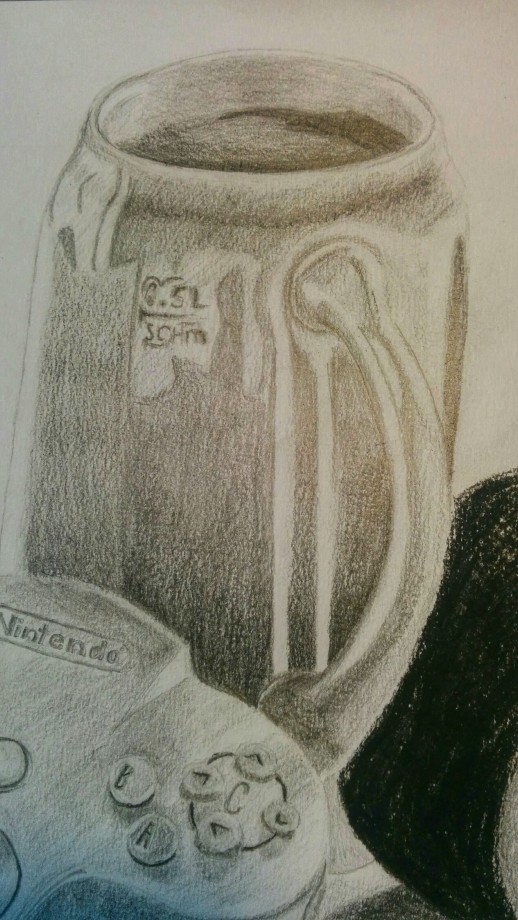
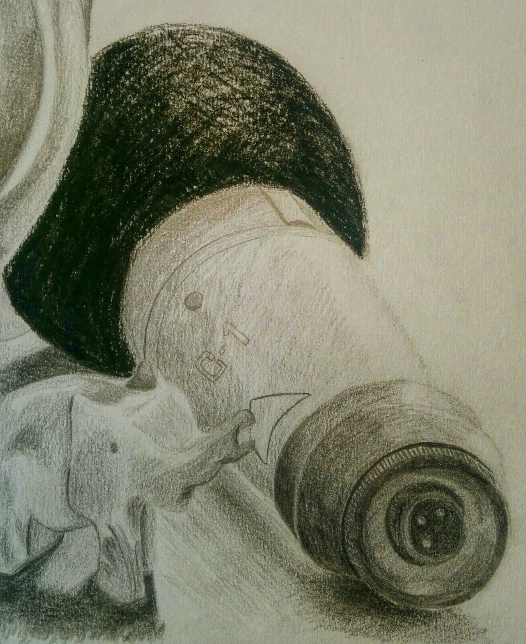
For this research point I have looked at a variety of still life work done by numerous artists over the past few centuries and I will look at how modern artists today have used similar techniques to develop the practice of still life drawing further.

Traditional Artists

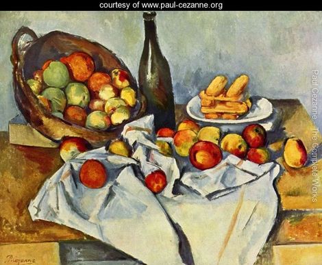
Paul Cezanne – 19th Cent.

From Cezanne’s work I can see that he liked to use a lot of thick strokes to create the shapes of the subject.  There tends not to be a lot of focus in the way of lighting and shadow but instead, the arrangement of his objects make use of their difference in colour. The colours themselves are very typical to what one can expect that particular item to look like for example below, the apples are of a very natural warm red and creates a welcoming mood the painting.

Still-life-with-bottle-and-apple-basket


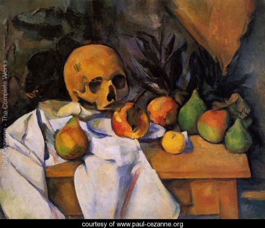
This painting demonstrates less attention being paid to the detail of the objects and more to do with capturing the arrangement and distinction between those objects. The colour of the skull and that of the table are quite similar so it could be argued that there was a conscious thought that there should be clear separation between the two and is something to consider when arranging my own piece.

Still-Life-With-Skull-large


Pieter Claesz – 17th Cent.

Straight away I can see that Claesz took a lot more time in creating a more detailed representation of his scene as opposed to Cezanne however where Cezanne would use a brighter assortment of colours so that the objects check against one another, Cezanne made use of the light and shadow that he was good at in order to contrast the objects. The colours are more subdued perhaps in a bid to make the scene more realistic.

skull and glass


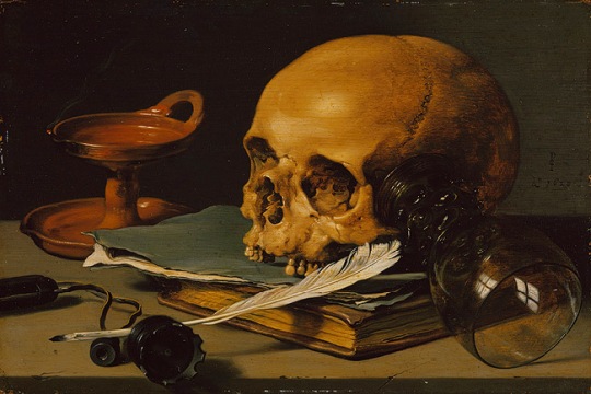
Often with art I believe that one of the greatest achievements is to represent a subject in the simplest possible terms, yet when I look at the picture below I cannot but help appreciate the incredible detail that Claesz has put into it. This painting demonstrates my point about contrasting objects even more so than the previous as a lot of the colours are very similar to one another and tend to sit around a monochromatic and yellowish set of colours so Claesz’s use of shadow and lighting shows it’s importance.


Breakfast Piece With Roemer, Oysters, Saltcellar, And Roll - Pieter Claesz, 1642


Modern Still Life

Moving on toward the 20th century we can see a drastic shift of trying to capture still life in a realistic setting to representing a scene in other ways and the strongest example of this is with cubism.

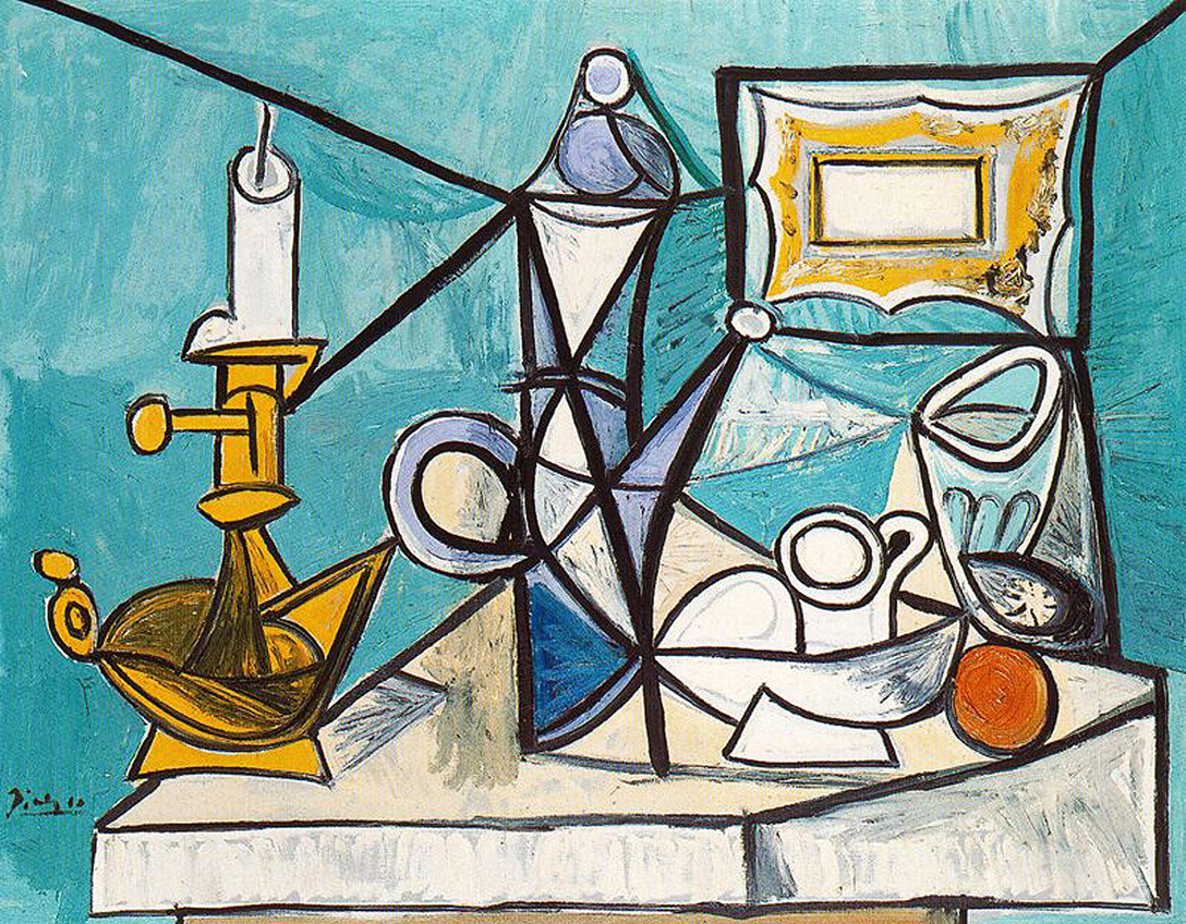
Pablo Picasso – 20th Cent.

Before this research exercise I not aware of Picasso’s work in still life, I had only ever seen his work with people and figures so it is refreshing to see something, which to me, is new of Picasso. Such as what I was saying earlier about how simplicity is so important in art, Picasso’s work truly defines this ideal. Looking at the painting below there are subtle points made on the objects which Picasso felt the need to include for example the candle stick on the left has a little bump down bu the side of it which suggests a melted drop of wax has collected at the base of the candle. Nothing more is needed to represent this aspect yet it comes across so clearly in the painting. Even when he draws a glass with such obscure lines and angles, we can still tell that the object is a glass because of other factors that it’s translucency and light blue colour.

still-life-with-lamp-1944


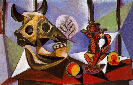
This painting show more detail in the objects than the previous and yet retains Picasso’s trademark style. I admire the perspective of the shapes that he has chosen to paint such as the shape of the bull’s head but he has then detailed it with some block shading and cracks along the bone. The jug has such a fascinating look to it that part of me hopes it is a real object! The pattern is such a peculiar choice compared to how the rest of the painting looks and even though the pattern does stand out, the general feeling of the painting does feel balanced. Another interesting point to look at are the shadows beneath the objects and how Picasso has chosen the include them in the style of the more background objects in the room. I must admit it was the last thing I noticed about this painting after I had observed all other aspects which demonstrates the strength of the objects in the room.


still-life-with-bull-s-skull-1939


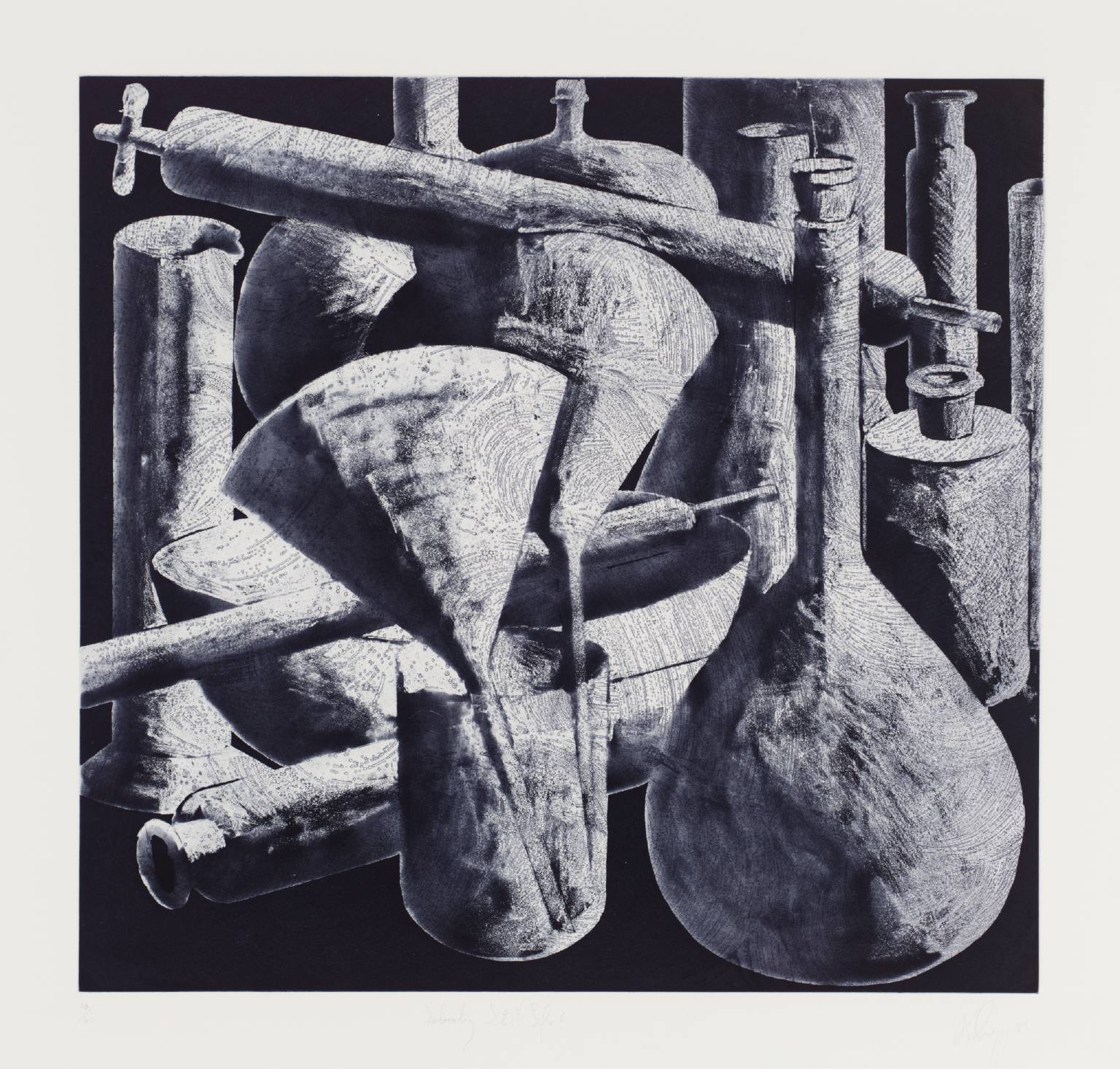
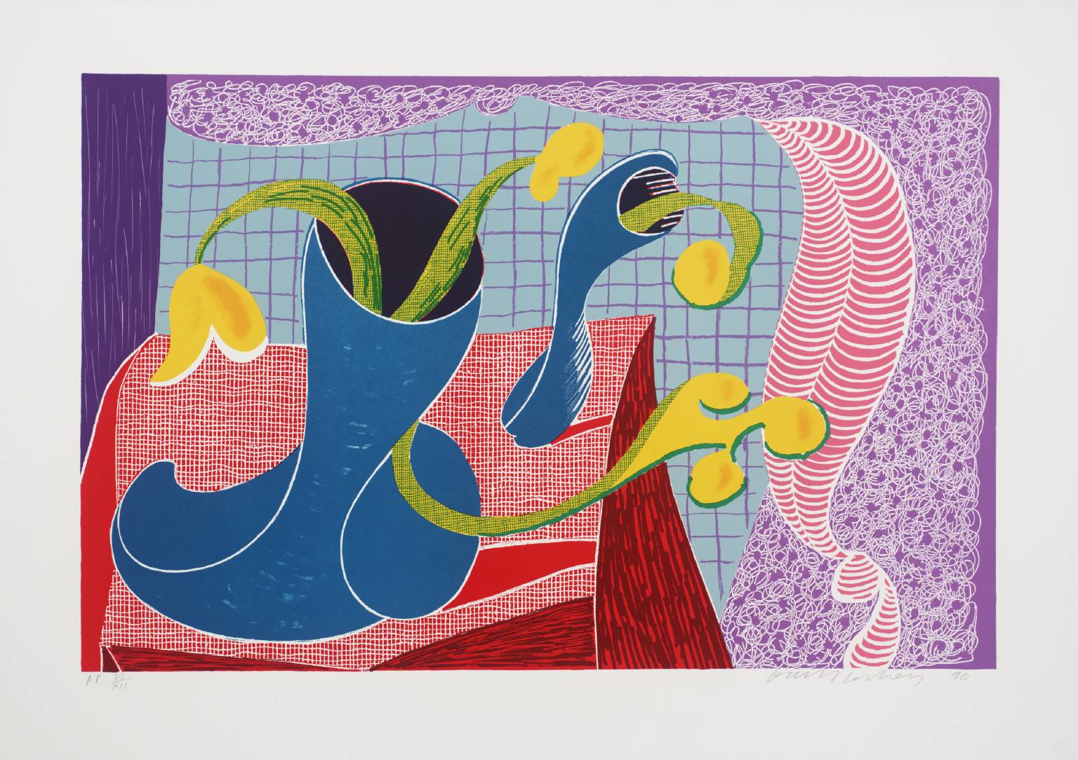
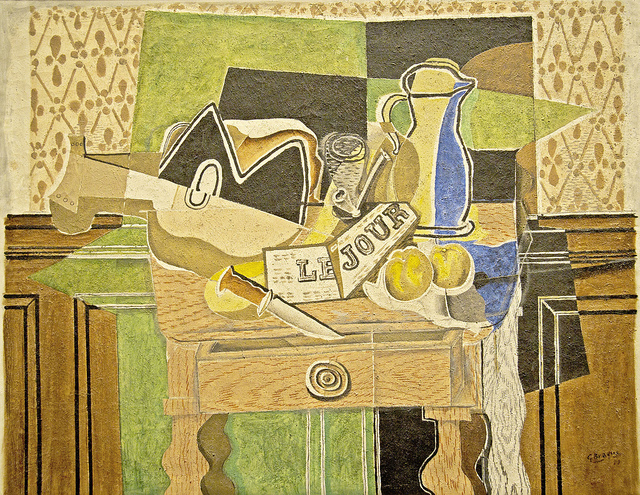
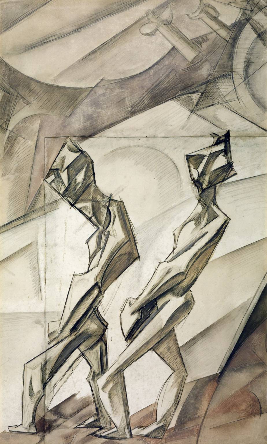
Georges Braque – 20th Cent.

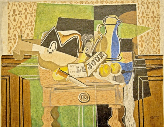
Sticking with the theme of cubism, this still life by George Braque is ignoring the concept of 3D space and the perception of depth is lost as all the objects appear to be on the same plain. Also, unlike some of the other paintings that I have looked at in this segment, the objects are not as easy to discern within the space that they occupy. The colours are light and earthy perhaps to reflect on the fact that most of the objects are either natural or made from natural materials for example the wooden guitar.

still life le jour 1929


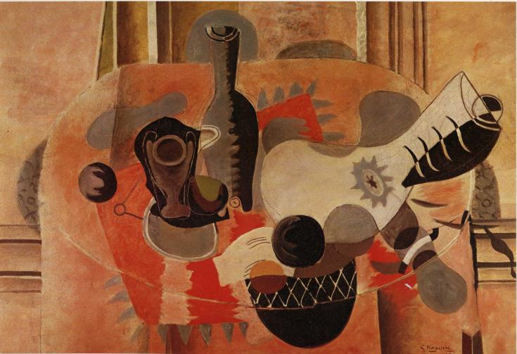
On this next piece, the objects are far more abstract and Braque has made them more difficult to understand immediately what they are. There appears to be more attention paid to the 3D space that the objects are in where you can see more clearly the table that the objects are on and how far back into the painting it goes. Again, Braque has chosen to go with a strict set of colours to use but with more reds and blacks than before.

still-life-with-guitar-1935


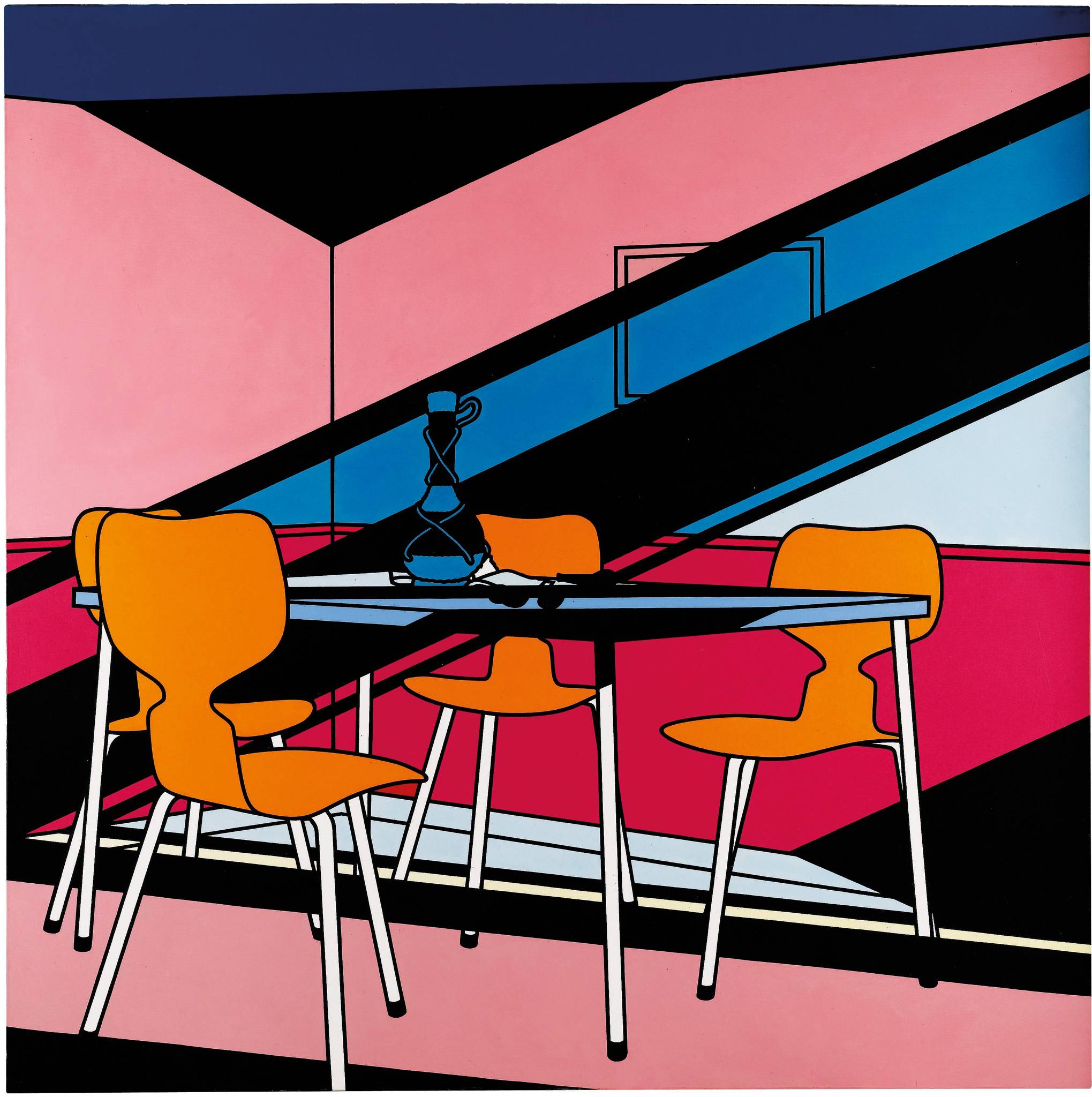
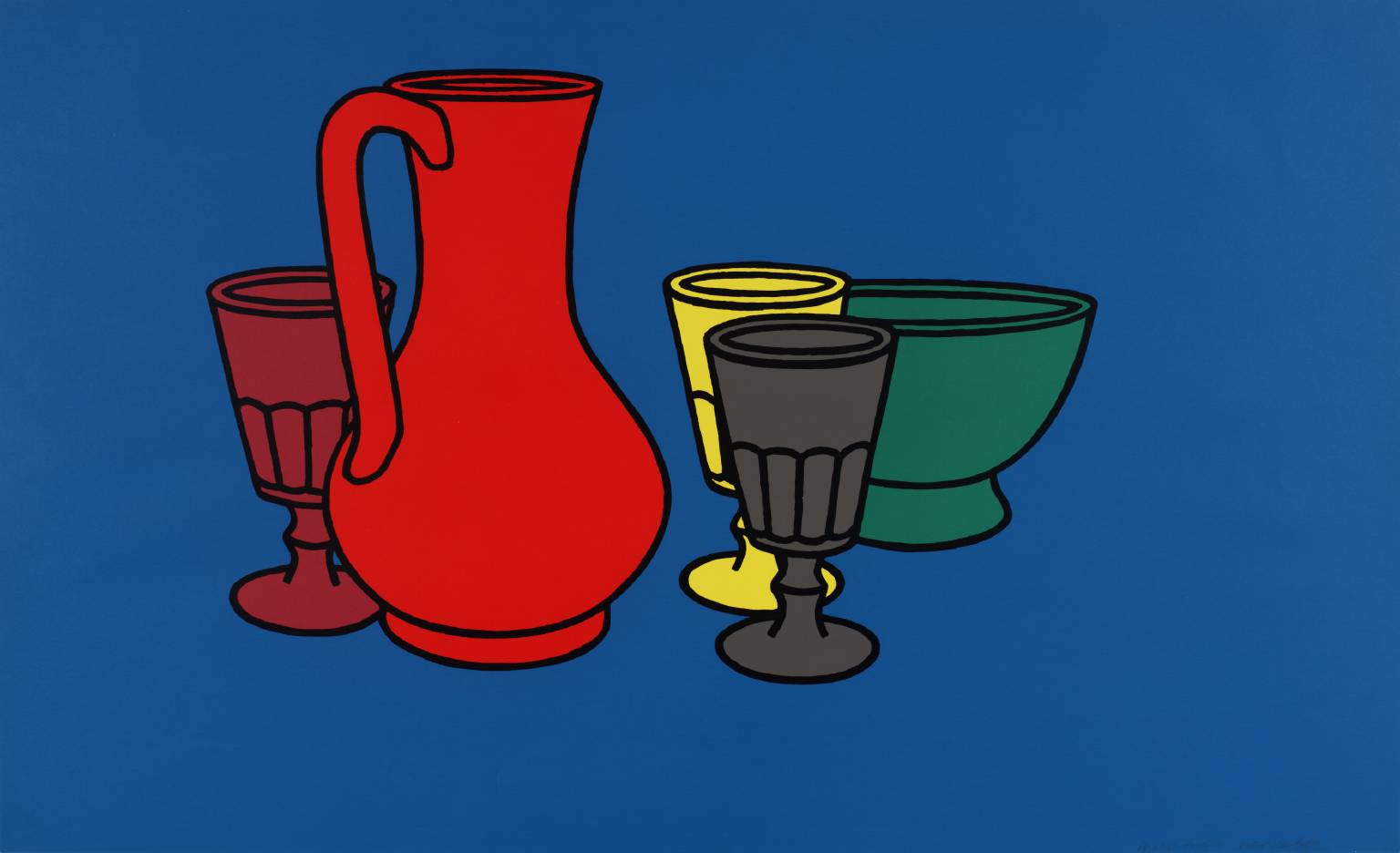
Roy Lichentstein – 20th Cent.

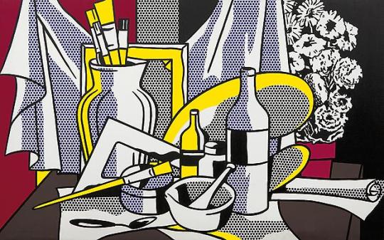
Lichenstein’s style  lends to breaking down objects to a near mechanical level so that with as little detail we can tell what object is what and understand it’s purpose immediately. What I do admire about this painting is the choice or lack there of, of colour and yet using competent shading with Lichenstein’s technique, we can clearly discern each objects against one another and it’s role in the space.

Lichtenstein_StillLife 1972


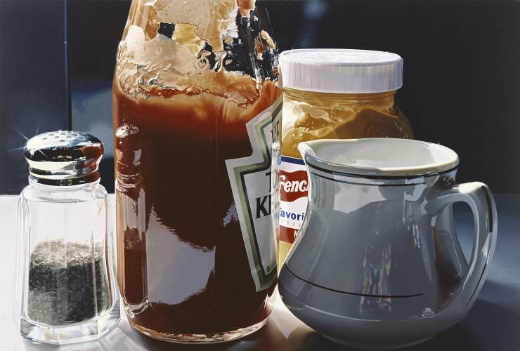
Ralph Goings – 20th Century

Goings is an artist that I was not aware of until I began doing research on this topic. He is a realist painter and manages to capture so many aspects of objects with such inscrutable detail as can be seen in this painting below. The first thing that stands out has to be the reflections on the objects in this still life and how Goings has paid so much attention to having objects appear on one another. Something else that I have to commend is the attention to the way the sauce has stuck to the inside of the ketchup bottle and the mustard jar and how particularly on the bottle you can differentiate between the front side of the bottle and the back.

Ralph Goings - condiment arrangement

Still Life Art Today

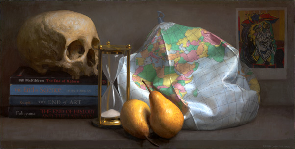
Conor Walton – It’s the End of the World As We Know It

This piece holds to more traditional tropes of still life with the inclusion of the skull and fruit. The deflated globe makes painting more familiar and is what makes the painting easily discernible from a traditional painting. The technique Walton has used is more akin to that of Claesz and there appears to be commentary made with the picture of a Picasso hanging from the back wall.

Conor Walton - It's the End of the World as We Know it


Emma Bennett, A Weightless Quiet, 2013

This piece caught my eye as it is the most unique painting from all the other in the sense that a still life generally is an assortment of objects on a plain or table. This artist has suspended her objects in free space creating a peculiar void and so we cannot be entirely sure what they are doing at the time. Could the objects be falling? Are they being thrown? Are they pinned against an invisible surface? There are a lot of possibilities for what role these objects play in the space.

Emma Bennett, A Weightless Quiet, 2013


Conclusion

From the earlier paintings that I have looked at there has been more time spent on associating the correct position of objects in a room and for example with Plaesz, he has clearly studied the concept of light and shadow to represent his objects. When moving into the 20th century there has been a rebellion of the ideal of what a still life means as represented by Picasso and Lichenstein. Whereas with more traditional still life painting there was attention paid to capturing as much of the scene as possible, Picasso and Lichenstein aimed to use there trademark techniques to express a still life as simply as possible whilst at the same time holding onto the traditional idea of a still life. At the same time, Goings pushed the bar the opposite way and aimed to capture as much as possible from the scene in his still life by expressing his painting as if captured by the human eye with the inclusion of lens flare and reflections of glass and shiny objects.

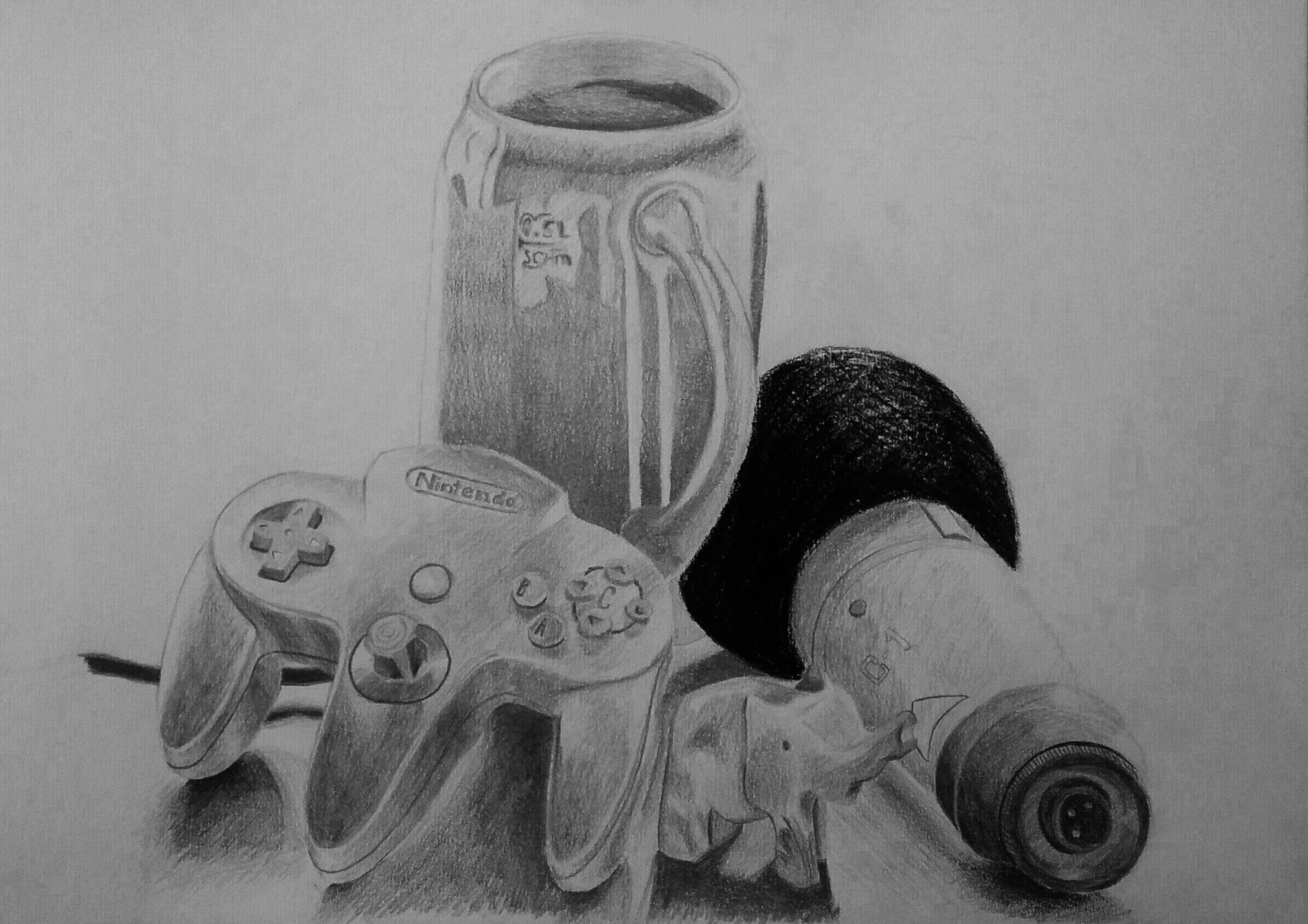
With the still lifes that I have observed, there is a limitation by the technique that some artists use for example Picasso, in cpaturing as much of the scene as possible so I guess it is up to me how far I want to go when creating a still life and how much detail I decide to use based on what style I would do a painting in.


Assignment #1: A Personal Still Life

Aim: To create a still life made with objects that have some significance to myself on a personal level and to create the drawing using a range of mediums and techniques that I have learned from this part of the course. (CLICK ON ANY IMAGE TO ENLARGE IT OR RIGHT-MOUSE CLICK AND OPEN IMAGE IN A NEW TAB)

IMG_20141125_111117~3~3


I have selected four specific objects that all have some significance to myself one way or another. The mug, Nintendo 64 control pad and the microphone all have some significance towards my creativity and demonstrates the multitude of creative interests that I have. I enjoy being able to do many different things from voice work to animation. I also enjoy making computer games although I have yet to get around to actually finishing one! The small elephant in the front is special because it is a present I got for my girlfriend and I know how much she likes it. Needless to say she is special to me and so I wanted to include it in my still life. I think if I were to show any of my friends this picture they could probably understand quite well the significance of these objects and why I chose them.

The Drawing

This drawing has been done on an A3 piece of fine grain cartridge paper using a variety of H and B Grade pencils and graphite sticks along with some soft charcoal. During some of the exercises on this course so far I have found that I sometimes start far too dark with the grades I use so for this drawing I began using a F pencil to draw the outlines and then progress onto a H pencil for the lighter tones and build my way up to at least 3B for the darker tones. Some shading like towards the bottom of the mug and the shadows beneath the objects I used a graphite stick usually 6B or 8B to get a much darker tone. I wanted to use at least one more medium to diversify the image so I saw the microphone foam cover as an opportunity to use a charcoal stick for two reason: 1) because the foam cover was jet black and I felt as though I could not get a dark enough tone with just graphite or pencil and 2) because I took special notice of the fact that even though it was so dark, there was clearly some sunlight reflected off the foam which I wanted to capture with the charcoal.

At first I was apprehensive about drawing the game controller which you can see on the left as it is such an unusual and complex shape, so much so that at one point I was going to replace it with a simpler one like the one below which as you can see, is nowhere near as complicated a shape:

SNES_Controller

This is a special item for me because it was in fact my first games console, yet the N64 controller means just that bit more to me and I think one of the reasons is because of how obscure and unique it looks. This was more than enough reason for me to continue using this particular object and I think the way it has turned out has given me the confidence to not be deterred by the complexity of an object as a reason to not draw something. Once I had drawn the control pad I felt more comfortable with doing the rest of the drawing.

I tried to capture the edges where light would reflect between two planes of shadow. For example the control pad below where the flat top meets the underside of the control pad. There is not a sharp edge and appears to have it’s own flat side as opposed to being rounded. I think that I achieved this well as you can see below.

IMG_20141125_125436~2


Also on the top of the mug where the sunlight was coming from above, I aimed to get the smoothed over of the lip of the mug to capture the light and then use the outlining shadow to distinguish that further.

IMG_20141125_125600~2

I am not entirely convinced by the shape of the mug and whether I have got that right, especially as the handle looks a little off. I think the lighting and reflections could have been done a lot better which is not to say that I didn’t spend enough time on this object, in fact  I probably spent more time trying to correct it than I did any other object, but it could have been the way I started doing the reflections and shading that led to these results. Perhaps next time I will try further to break apart the reflections on the mug to make them more convincing.

IMG_20141125_125516~2

The elephant was a little more difficult to capture shadows as most of the surface was smoothed over almost all the way round but paying attention to the objects behind and how they project their shadows onto it gave me a better idea of where I should focus the lighting. Drawing this object did help me realise the importance of lighting and leaving certain areas white to illuminate edges and so forth, for example the ridge atop the elephant’s head is there to signify where it peaks.

IMG_20141125_125543~2

The microphone was, generally speaking, quite an easy object to draw but it still came with some difficulties. I was concerned with the bottom part closest to the viewer as there were a  lot of hidden details such as the ridges along the outside rim and certain places where there was a lot of dark shadow against black plastic and vice versa. I think I managed to achieve the sense of the dark plastic while still retaining the elements of light and dark on the object. The top of the microphone with the foam, as mentioned earlier, was done using a soft charcoal stick. After the marks and lines exercise earlier on in this segment, I wanted to use this as another opportunity to see if I could actually do crosshatched shading properly. Now I know it is not a particularly challenging area to do so but I feel I have managed to capture not only the darkness of the foam by using charcoal but also the light that still falls on it from above.

One problem I came to realise a bit too late on was that I was not sharpening my tools nearly enough. I kept using them until they became flat which was good to get a decent spread over the paper of a particular even shade but I think I ended up sacrificing a lot of detail because of it. I did very much enjoy the choice of surface, it really had a good tooth for everything I used and will definitely want to do more sketching on this particular type of paper in the future.

Overall I think this assignment has been successful. I can see the areas where I am strongest and also where I need to improve. I will use this post as a reference for my future work so I can come back and learn from this piece.


Gallery Visit – Manchester Art Gallery

Today I visited the Manchester Gallery to see if I could find some examples of artists drawing styles. There is currently an exhibit on called The Sensory War 1914-2014 which examines artists work from 1914 to the current year and demonstrates war in all it’s facets from engineering to medical advancements. Not only were there plenty of extraordinary pieces on display for me to explore techniques styles but there was also with there being so many decades worth of war imagery that were both exciting and horrifying that the contemplating the importance of the subject matter and it’s effect on the piece became an invaluable part of my visit to the gallery. On a side note, it was completely unitnentional that I should visit the gallery on Remembrance Day yet seemingly apt that everyone else there and myself should experience this gallery during the two minute silence.

As the gallery did not allow the taking of pictures which is understandable, I made a point of marking down which artists stood out for me and that I could use as a point of reference for technique for my own work.

Wyndham Lewis

The first artist’s work on display that caught my eye was Wyndham Lewis. His painting “Two Mechanics” from 1912 demonstrated immediately some of the uses of mark making and line work that I have been learning at the beginning of the course. The figures have been drawn with abstract intention and yet the definition made by hard blocks of shading and thick outlines add a lot of obscurity them. I can see a mix of hatch shading with the watercolour that Lewis used in the background specifically. Lewis has done this with a lot of simplicity in mind, something I should take on board where there does not need to be a lot of it to create a lasting effect.

Two Mechanics circa 1912 by Wyndham Lewis 1882-1957

Heinrich Hoerle

Hoerle is a German painter who took inspiration not least of all from the aftermath of war. His work, Die Krüppel or The Cripple Portfolio contains some very striking imagery of those who have been most afflicted by the weapons of war, showing the loss of limbs and tragedy of those whose must live without them. He has a very distinctive style which is why I have included him in this post.

The Three Invalids 1930

The Three Invalids 1930


The Three Invalids is definitely a subversive image. I looked at the painting for a good minute or two before reading the description to see if I could make sense of what it represented. At first I thought it was a celebration of man and maths with how some of lines are in perfect sync both on the buildings and the figures. Then I considered how it represented augmentation and robotics. At this point I was curious what year it was painted in and in reading the description, learned that there were elements of everything I had thought it to be and finally the name of the painting also made sense. In terms of technicality of the painting, I really admire the geometry of the shapes used for both the men and the buildings mixed with the more accurate representation of their heads. This to me demonstrates how since the war, these men have become more mechanical and also how much of their humanity has been forcibly taken from them.

The Cripple Portfolio or Die Krüppel 1920

CripplePortfolio_2

CripplePortfolio_1

Similar to The Three Invalids, Die Krüppel focuses on the aftermath of war and the results it bares. In this particular set of images there seemed to be a stark contrast from sadness to madness as is demonstrated by the two images above. The first one shows the man who has lost his arms and feet looking intensely at an arrangement of pots containing hands, indicating madness and insanity from the loss of not only his limbs but seemingly his mind as well. The second picture is something a lot more typical and perhaps something that each of us have witnessed at some point even in today’s world where a man begs for change while wearing the uniform he used for the war.

Both images are done using lithography and in it’s simplicity gives the onlooker a chance to focus on the subject. There is little detail and hardly any shadow or lighting and the figures are more like caricatures than depictions of real people. It could be the juxtaposition of the two that gives these images such an impact.

CRW Nevinson

One particular artist’s work that caught my eye almost immediately was that of CRW Nevinson (or Christopher Richard Wynne Nevinson). He was one of the foremost wartime artists and was also a wartime correspondant. His paintings would most commonly reflect what he had seen during the war and in doing so has created incredibly vivd imagery of those events which grab you as soon as your eye catches it. I managed to find a couple of examples of the work that I saw in the gallery. This was also my first time seeing lithography which I had not heard of until I researched this particular painter.

The first one I would like to talk about is called “Making the Engine” 1917.

image

I enjoyed how this picture focuses on one worker who seems to be engulfed by machinery and that he along with hundereds of other men in the factory, are all additional parts that make the machines work, like gears and cogs. This is emphasised by the lack of detail on the faces making them less personable and also by using a lithograph, producing one monochromed image where every aspect of the picture is equal. I really do like the contrast of the belts that stream back and forth and go right to the back of the room, suggesting an neverending production line.


Another one of Nevinson’s paintings that I saw was called “Acetylene Welding”. The image shows two women working on welding metal.

Acetylene Welding 1917 by Christopher Richard Wynne Nevinson 1889-1946

The combination of his fine line work and the lithograph print has created an explosion of light from the centre of the image. It really does feel alive with activity as the sparks fly out from the machine. I really admire the detailed line work of the objects and the people and then the fine layers on top which distinguish the sparks and light.

The last painting by Nevinson that I found particularly appealing is called “Sweeping Down on a Taube”

Sweeping Down on a Taube 1917 by Christopher Richard Wynne Nevinson 1889-1946

This was perhaps my favourite image not only of Nevinson’s but also the day. By knowing where and where not to put marks, Nevinson has created incredibly vibrant and vivid imagery which clearly depicts the energy and sudden nature of war. As the explosion bursts light beams through the clouds from below we can see it shattering the sky where the plane and a lone bird silhouette so effectively against it. Like the last picture of the welders at work, the lithography on the painting and perhaps even some slight decay over time, has left some hairlines scratches along the image which can easily be utilised as sparks once again.


I have learned a lot from my visit to the gallery and specifically this exhibit. A lot of very invoking imagery towards the war and yet much of it has been done using simple methods for striking results. I often consider how much detail I need to go into when doing my own drawing and that perhaps if I am trying to convey a message of some sort then I don’t need to think too deep to portray that message.

Project 2 Exercise 4: Shadows and Reflected Light

This exercise looks at reflective objects and highlights from lighting. I chose a large tea tin and a very shiny stainless steel teapot for my drawing.

IMG_20141125_114534~2~2


I tried to use the cross hatching method from the previous sketch for practice on the shadow along with a mixture of broad strokes with the side of the charcoal stick. At first I was unsure about defining the lines of the reflections so much but I feel as though this has worked quite well and is effective at demonstrating them. The tin reflecting on the teapot can be seen and gives the impression well in my opinion. At least one area for improvement would be the tin as it does look a little more stripy than reflective. Also the shadowing underneath the objects could have been better defined but I think I was focusing on getting the reflections as good as I could.

The workflow this piece was quite interesting. Generally I really do not like to have to start a piece from scratch again once I have already started one of them. I got to doing the end of the reflection of the tin and was very unimpressed with my work so I started again while trying to focus on the doing cross hatching as you can see below.

IMG_20141125_114608~2~2


Once I had gotten to this point I was even more unimpressed and so upon reflection of the original piece, I decided to return to it and see if I could improve upon it further. I was glad I did because the second drawing I started was infinitely worse than the first in my opinion. I got a better grasp of what it meant to represent a reflection and so the first drawing was finished.

I think in the future I will have a better idea of how to do reflections on objects now and I am very happy with my understanding of objects reflecting off of one another.

Project 2 Exercise 3: Creating Shadow Using Lines and Marks

The main focus of this exercise is to continue looking at shadow but to use lines and marks to create them.

IMG_20141125_114356~2~2

This exercise was one of the more difficult ones I have had to do so far. One of the guidelines in the exercise description said not use obvious outlines and instead create the shape using the shading. Because it is comprised entirely of cross hatch marks, I found it challenging to get the shapes of the objects right just using this method. I reckon I have achieved the general shapes of the objects quite well but I can help but think the cross hatching could be stronger. The pot on the right for example does seem a little faint, the reason being that I was not confident with the technique enough to make bold enough marks because occasions when I did I would often have marks leave the boundary of the objects. I need to take my time with cross hatching and use more focused strokes to define an objects outline.